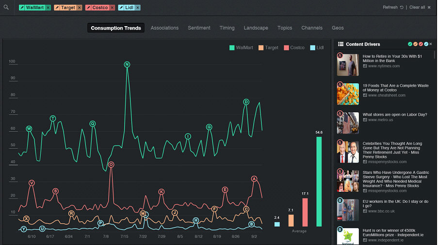
The Consumption Trends graph is the default display when you open the Insights screen. It displays the consumption trends of the seed interests over the time period set in the Time filter.
The consumption trend is measured based on a relative index score, where the value 100 represents peak content consumption during the selected time frame, and all other points on the graph are relative to that.
For every point on the graph, you can see its index score and the relative change compared to the average consumption of the interest in that time frame. For instance, you can use the change from average. data point to see which brand was impacted the most from a marketing campaign.
The Consumption Trend graph
On the right side of the screen a list of examples of the seed interests’ sources are displayed. Each example is given a letter corresponding to a high point on the graph, and the five examples with the highest consumption are shown for each point. The letters are ordered alphabetically, with ‘A’ being the most recent.
Clicking on a letter scrolls the examples list to that letter’s examples. Clicking on an example opens its source.
To the right of the trend graph are the average index scores of each of the seed interests over the set time period.
This graph, along with the rest of the insight features, can be filtered by Channel, Topics, Demographics, Geo and Language.
See Also: